On the previous layout, I didn't meld the colors at all, making the backdrops, at best, a horrible caricature of what you see in real life. See the blog post here for what I did for version 1.
Using a couple of Youtube examples to pump my enthusiasm up, I decided to give one of the techniques a try, which I think worked fairly well.
The video I say mentioned just starting with a deep blue and then lightening it up with additional white paint.
Since I still have the two different blue hues from version 1, I decided I might as well keep that same paradigm on the current layout.
The technique is as follows:
Start with your dark blue - pour into your paint try and roll from the top of the backdrop down about halfway to two thirds of the way.
Now, pour some white into the tray and mix with your roller.
With the much lighter paint, cover the part you didn't before.
Use a brush with some of the white to feather the line between your colors.
Then take a dry roller and go over where you brushed to erase the brush marks.
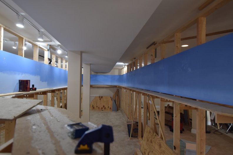
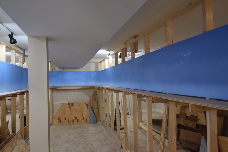
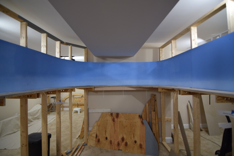
I had pretty decent success using this method, as you can see below.
I think the next time, I am going to have separate trays for my blues and just mix on the roller itself.
 |
| A view down the middle aisle where I started. Note the original backdrop at far left from version 1 and the obvious, sharp line between colors. |
 |
| Down the aisle now. I might need to try and move the lighter color higher up the backdrop on the next pieces I do. |
 |
| My favorite shot of this batch of photos of the effort. |
As I've started lately, additional pictures are on the full site in the construction gallery.
No comments:
Post a Comment